Jane, I like this one better. I think the center circle looks more integrated into the whole piece than the other one.
this one.
I agree. The bottom one is more whimsical and has a sense of movement. The top one is more readable as a functional compass.Nancy
this one, definitely
the bottom one appeals to me in that it has more movement, almost like a spinning top, but the top one is more like a compassxo
I like this one better too. More graphic and balanced than the other one.
this is my favorite.
Hi Jane, I like the top one too, because of the smaller center wheel and the design features.
Top one ... it just sits better - not sure why ...
I like the top one, also...
This top one is more "readable". The other looks like a whirligig.
Thanks so much for visiting JaneLaFazio.com!

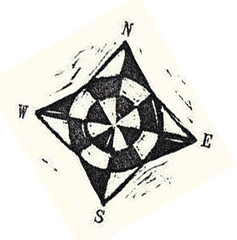 I'm working on artwork for a fundraiser, and spending way too much time on it. A small part of the art is a compass. Which of these works better?
Jane, I like this one better. I think the center circle looks more integrated into the whole piece than the other one.
ReplyDeletethis one.
ReplyDeleteI agree. The bottom one is more whimsical and has a sense of movement. The top one is more readable as a functional compass.
ReplyDeleteNancy
this one, definitely
ReplyDeletethe bottom one appeals to me in that it has more movement, almost like a spinning top, but the top one is more like a compass
ReplyDeletexo
I like this one better too. More graphic and balanced than the other one.
ReplyDeletethis is my favorite.
ReplyDeleteHi Jane, I like the top one too, because of the smaller center wheel and the design features.
ReplyDeleteTop one ... it just sits better - not sure why ...
ReplyDeleteI like the top one, also...
ReplyDeleteThis top one is more "readable". The other looks like a whirligig.
ReplyDelete