
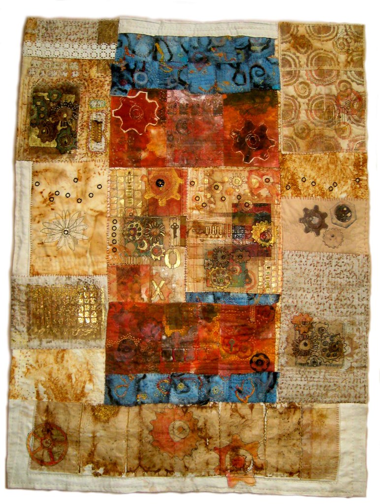
Size: 36x48 inches.
Well, what do you think? I've been so close to it...I just don't know. Most of the time I love it--but I realize it's really different....
Added 3/12/2011
Title: Industrial Aged
Artist Statement: Rusty forgotten gears, mysterious machine parts. Perhaps an ancient instructional manual with text no longer legible…. taking on the appearance of an illuminated manuscript. How did the parts fit together? What part did they play in the making of something? How much time as passed since they were used? How is the space between ages marked?
I really like the bright pops of color among the neutrals. I can see some of your handstitching, but I wish there were closeups so I could reaaly appreciate its complexity. Looks like there are some teabags involved. I agree it seems very different from your usual work, but I think it holds together beautifully.
ReplyDeleteWhy not...be different, I mean. Complementary colors, gears and flowers, neutrals and brights...all good. I like this piece really well.
ReplyDeleteYes different, but I like it to...
ReplyDeleteI love it! The golden and sepia hues, the pops of colour, the patterns...I also wish there was a close up - I want to look at it closer to see all the details!
ReplyDelete~ Sara
Beautiful. I like the sepia and blues and all the little spots of colors and textures.
ReplyDeleteBeing a 'beige' girl, I love your new piece Jane. Does it have echos of Italy and that lovely tufa rock of Orvieto? Brava! Kristi
ReplyDeleteYes, it's different, which is why it's really COOL!! I'm really into the vintage-y (dare I say wonky vintage-y) look, with the look of the industrial components e.g. gears, etc. How about some of the charm like embellishments as in clock face, clock hands, metal pieces of "stuff".... Oh, I'm really liking this!!
ReplyDeleteIt's really different but in a GOOD way! [Are tea bags involved???]
ReplyDeleteHow could you not love it Jane? It is really, really FABULOUS!!!
ReplyDeletexo
I love the texture and pop of color.
ReplyDeleteI can just hear those gears creaking! It has a feeling of something very old that's been unearthed and yet it's contemporary and vibrant. The eye keeps moving (circles help!) to take it all in. Very, very interesting, Jane!
ReplyDeleteI think it's FABULOUS!! Love all the textures & rusted fabrics.
ReplyDeleteI can't say whether I like it or not...but it draws you in...and MAKES you keep looking at it and everything in it. Oh my!
ReplyDeleteIt is absolutely stunning. I love the colors!!!!
ReplyDeleteIts fantastic!! Would love more shots and close-ups.
ReplyDeleteOh, yeah...it's great. I love the vintage feel of the creams and rusty things but my favourite part is the lovely rich red centre bits.
ReplyDeleteBeautiful work, Love it!!
ReplyDeleteI love the palette, Jane. and the pattern. My eyes won't stop moving around it!
ReplyDeleteI love it! It is so interesting to look at. My eyes can't stop wandering around the quilt squares. I really like the shades of blue and red that you used. It is reminiscent of Steampunk style with what looks like gears and especially the work of Austrian painter Gustav Klimt. Wow. The more I look the more I find to love. I so very much want to touch it. Yummy Yummy.
ReplyDeleteI did notice the horizontal cream stripe of fabric at the top of the quilt. As I said before, my eyes joyfully wander around the rest of the quilt until I come to that stripe then I come to a jarring stop. The cream border on the bottom works well. Maybe it's because the orange gear at the bottom extends into the cream border guiding your eyes to the left of the quilt. Perhaps if a design were added in a small section of the cream horizontal stripe the eye would freely continue it's journey around this scrumptious quilt. Different is awesome!!! Thank you for the treat.
It IS different, and very interesting to look at! I like those "pops" of darker colors. I wonder if the piece needs one more burst of the blue/orange. (I fully admit that I tend to make patterns of threes or fives in my pieces, so that's just my preferences talkin'....)I think it's a very cool piece.
ReplyDeleteThat golden glow, the colors, patterns, texture - I would be happy to hang it on my walls!
ReplyDeleteMF
This is sooooo beautiful! I love the colors. It reminds me of an illuminated manuscript.
ReplyDeleteHad to comment after seeing the real thing today - awesome to the tenth power!
ReplyDeleteAs you can see, I am way behind on blogs.
ReplyDeleteI will take this off your hands if you're still not sure :)
Seriously, this rocks. Totally. I really like it a lot. Quite successful.