
To much fun Go to http://bighugelabs.com/colors.php and download your photo and they created a color palette. Way fun! (I do a screen capture, then copy it into photoshop, and save as a jpg.)
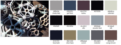
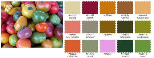
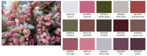
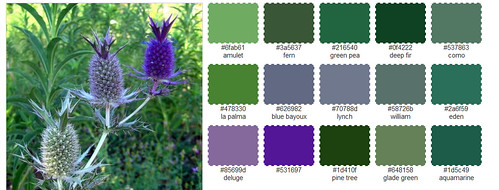
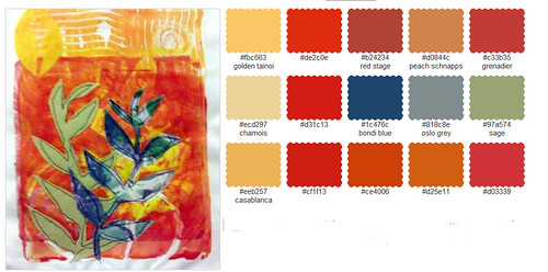
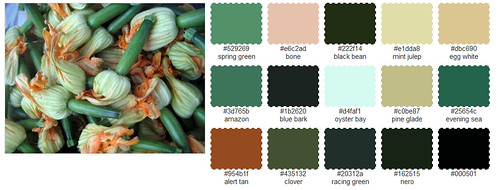
If you were going to make art from one of these color palettes, which would you choose?
Can't wait to check this out Jane! Thanks for sharing!
ReplyDeleteI love those greens and purples. Thanks for the link.
ReplyDeleteThis is so neat! Thanks for sharing!
ReplyDeleteThere are too many lovely choices, but I think that my favorite is the third one with all the soft pinks and greens. This looks so fun, I will have to try it with my own photo.
ReplyDeleteOh Jane I love this !!! I would love to see the thistle ,#4, colors in an art piece !! Love love love.... Thanks Jane !!
ReplyDeleteThat site is so much fun! Thanks for sharing! My color palette lately would be the fifth one listed. I've been into yellows, oranges, etc.
ReplyDeleteAddictive isn't it Jane? LOL
ReplyDeleteI LOVE them all...
My favorite is the palette from your art piece. The tomato one is a good one too.
ReplyDeleteMMMMMmmmm... the flowers. Thank you for the link this is amazing.
ReplyDeleteWhat a neat idea!! I would use the colour palette with all the rich reds and oranges that you used in your mono printed piece... Can't wait to try it myself, as I have a photo that I would like to quilt!!
ReplyDeleteThank you for sharing!
ReplyDeleteYour samples are all inviting to try, but #1 is the most challenging to do.
I would definitely pick the next to the last one - your color palette has always tickled my beta endorphins!
ReplyDeletexo
I read the word "tomatoes", and I stopped and thought .. what tomatoes? So I went and looked again,.... I had thought they were jelly beans! I guess I need another cup of coffee! Isn't that hilarious? I would choose the purple and greens or the picture of above in pinks! Thanks so much for the link!
ReplyDeleteHave a MARVELOUS DAY JANE!
Jane, I like the one made from your artwork. I'm really into those warm colors and they make me feel happy.
ReplyDeleteWhat fun! the palette I am drawn to is the second one, with all the tomato colors. I tend to work in light bright pastels in my quilting!
ReplyDeletein a word: fabulous!
ReplyDeleteoh - which ones would I gravitate to? the second one and the fourth one. Delicious!
ReplyDeleteThis is great! I have a photo that I love and am using it to choose paint for my studio. This helped a bunch.
ReplyDeleteOh my, LOVE!!!
ReplyDelete